import os
from time import time
import feather
import pandas as pd
import numpy as np
import matplotlib.pyplot as plt
from matplotlib.ticker import NullFormatter
%matplotlib inline
import seaborn as sns
from sklearn.manifold import TSNE
from sklearn.datasets import make_circles, load_digits
from sklearn.preprocessing import StandardScaler, PowerTransformer
import umap
import umap.plot

from sle.modeling import generate_data
%load_ext autoreload
%autoreload 2Dimensionality reduction / projections
Citation
This notebook contains analyses for the following project:
Brunekreef TE, Reteig LC, Limper M, Haitjema S, Dias J, Mathsson-Alm L, van Laar JM, Otten HG. Microarray analysis of autoantibodies can identify future Systemic Lupus Erythematosus patients. Human Immunology. 2022 Apr 11. doi:10.1016/j.humimm.2022.03.010
Setup
Running the code without the original data
If you want to run the code but don’t have access to the data, run the following instead to generate some synthetic data:
data_all = generate_data('imid')
X_test_df = generate_data('rest')
Code for loading original data
data_dir = os.path.join('..', 'data', 'processed')
data_all = feather.read_dataframe(os.path.join(data_dir, 'imid.feather'))
X_test_df = feather.read_dataframe(os.path.join(data_dir,'rest.feather'))
TSNE
Toy data
From https://scikit-learn.org/stable/auto_examples/manifold/plot_t_sne_perplexity.html#sphx-glr-auto-examples-manifold-plot-t-sne-perplexity-py
n_samples = 300
n_components = 2
perplexities = [5, 30, 50, 100]
X, y = make_circles(n_samples=n_samples, factor=.5, noise=.05)
red = y == 0
green = y == 1(fig, subplots) = plt.subplots(1, 5, figsize=(25, 5))
ax = subplots[0]
ax.scatter(X[red, 0], X[red, 1], c="r")
ax.scatter(X[green, 0], X[green, 1], c="g")
ax.xaxis.set_major_formatter(NullFormatter())
ax.yaxis.set_major_formatter(NullFormatter())
ax.set_title("Original data")
plt.axis('tight')
for i, perplexity in enumerate(perplexities):
ax = subplots[i + 1]
t0 = time()
tsne = TSNE(n_components=n_components, init='random',
random_state=0, perplexity=perplexity)
Y = tsne.fit_transform(X)
t1 = time()
print("circles, perplexity=%d in %.2g sec" % (perplexity, t1 - t0))
ax.set_title("Perplexity=%d" % perplexity)
ax.scatter(Y[red, 0], Y[red, 1], c="r")
ax.scatter(Y[green, 0], Y[green, 1], c="g")
ax.xaxis.set_major_formatter(NullFormatter())
ax.yaxis.set_major_formatter(NullFormatter())
ax.axis('tight')circles, perplexity=5 in 0.88 sec
circles, perplexity=30 in 1.1 sec
circles, perplexity=50 in 0.95 sec
circles, perplexity=100 in 1.3 sec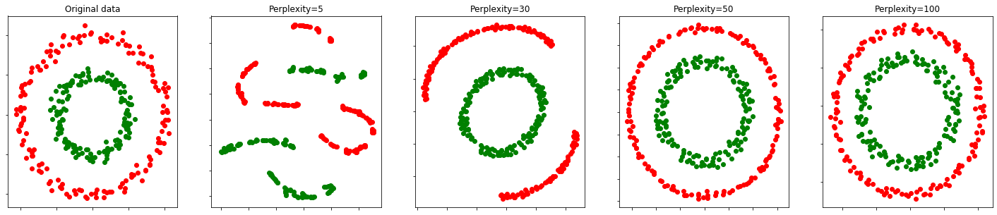
Real data
data_all.head()| Actinin | ASCA | Beta2GP1 | C1q | C3b | Cardiolipin | CCP1arg | CCP1cit | CENP | CMV | ... | SMP | TIF1gamma | TPO | tTG | Arthritis | Pleurisy | Pericarditis | Nefritis | dsDNA1 | Class | |
|---|---|---|---|---|---|---|---|---|---|---|---|---|---|---|---|---|---|---|---|---|---|
| 0 | 94.8911 | 1117.530 | 1328.0800 | 88.0225 | 115.4250 | 55.1872 | 42.1010 | 40.3490 | 65.5990 | 1177.9000 | ... | 157.0750 | 283.8950 | 1011.080 | 170.611 | 0.0 | 0.0 | 0.0 | 0.0 | 11.0 | SLE |
| 1 | 99.9188 | 1295.260 | 119.1230 | 133.0480 | 59.4884 | 39.9630 | 39.0714 | 39.0714 | 35.5006 | 1023.6600 | ... | 114.7650 | 84.1488 | 1111.850 | 146.075 | 0.0 | 0.0 | 0.0 | 1.0 | 63.0 | SLE |
| 2 | 121.3530 | 2636.220 | 38.4903 | 85.9066 | 117.8180 | 38.4903 | 42.0952 | 40.2934 | 53.7753 | 76.1163 | ... | 113.3960 | 154.8510 | 109.857 | 128.418 | 1.0 | 0.0 | 1.0 | 0.0 | 2.6 | SLE |
| 3 | 145.0990 | 995.634 | 509.1220 | 171.8770 | 179.0070 | 60.6069 | 67.8459 | 52.4473 | 203.9280 | 8717.1000 | ... | 148.6730 | 4777.2800 | 765.190 | 211.928 | 1.0 | 0.0 | 0.0 | 1.0 | 1.6 | SLE |
| 4 | 66.0117 | 994.225 | 40.8654 | 184.3840 | 85.9921 | 44.1397 | 42.5038 | 43.3220 | 33.4571 | 3849.9300 | ... | 66.8153 | 103.4140 | 716.172 | 237.993 | 1.0 | 0.0 | 0.0 | 1.0 | 22.0 | SLE |
5 rows × 63 columns
data_all.shape(1408, 63)data_all['Class'].value_counts()SLE 483
BBD 361
IMID 346
nonIMID 218
Name: Class, dtype: int64symptoms = ['Arthritis', 'Pleurisy', 'Pericarditis', 'Nefritis']
for col in symptoms: # convert to boolean, so 0 or NaN become false
data_all[col] = data_all[col].fillna(False).astype('bool')data_all['Symptoms'] = 'more_than_one' # new column for symptoms with default value for patients with more than one symptom
data_all.loc[data_all['Arthritis'] & ~data_all[['Pleurisy','Pericarditis','Nefritis']].any(1),'Symptoms'] = 'arthritis_only' # patients with only arthritis
data_all.loc[data_all['Nefritis'] & ~data_all[['Pleurisy','Pericarditis','Arthritis']].any(1),'Symptoms'] = 'nefritis_only' # patients with only nefritis
data_all.loc[data_all[['Pleurisy','Pericarditis']].any(1) & ~data_all[['Nefritis','Arthritis']].any(1),'Symptoms'] = 'pleurisy_or_pericarditis_only' # patients with either pleuritis or pericardits and nothing else
data_all.loc[~data_all[symptoms].any(1),'Symptoms'] = 'none' # patients with no symptomsdata_all.Symptoms.value_counts()none 1040
nefritis_only 108
more_than_one 102
arthritis_only 101
pleurisy_or_pericarditis_only 57
Name: Symptoms, dtype: int64df = data_all.copy()
y_class = data_all["Class"]
y_symptom = data_all['Symptoms']
X = np.array(data_all.loc[:, ~data_all.columns.isin(symptoms + ['Class'] + ['Symptoms'] + ['dsDNA1'])])df_symps = (sle .groupby(symptoms) .size() #.reset_index(name=‘counts’) #.sort_values(by=‘counts’,ascending=False) ) df_symps
Default parameters
tsne = TSNE(random_state=0, verbose=1)
Y_tsne = tsne.fit_transform(X)
[t-SNE] Computing 91 nearest neighbors...
[t-SNE] Indexed 1408 samples in 0.014s...
[t-SNE] Computed neighbors for 1408 samples in 0.230s...
[t-SNE] Computed conditional probabilities for sample 1000 / 1408
[t-SNE] Computed conditional probabilities for sample 1408 / 1408
[t-SNE] Mean sigma: 1413.796264
[t-SNE] KL divergence after 250 iterations with early exaggeration: 68.268234
[t-SNE] KL divergence after 1000 iterations: 1.017738# add tsne results back to pandas dataframe
df['tsne_1'] = Y_tsne[:,0]
df['tsne_2'] = Y_tsne[:,1]plt.figure(figsize=(7,7))
sns.scatterplot(
x="tsne_1", y="tsne_2",
hue="Class",
data=df,
alpha=0.5)
plt.axis('off')(-52.50039465973089, 40.55504019806097, -62.39752480691256, 49.14921090310397)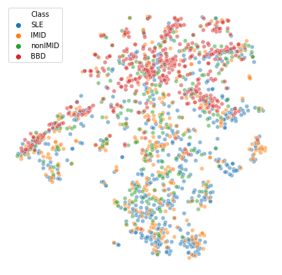
- The blood bank controls (
BBD) are the most prominent cluster - SLE patients also seem to cluster together at the bottom
- IMIDs seem a bit closer to SLE than the nonIMIDs are
- There could be a 2nd cluster smaller that is a mix of all 4 groups. Check if we also see this with different perplexities/UMAP
Different perplexities
perplexities = np.linspace(5,50,10)SLE = y_class.values == "SLE"
IMID = y_class.values == "IMID"
nonIMID = y_class.values == "nonIMID"
BBD = y_class.values == "BBD"
(fig, subplots) = plt.subplots(2, round(len(perplexities)/2), figsize=(25, 10))
i = 0
j = 0
for perplexity in perplexities:
if i == round(len(perplexities)/2):
i = 0
j = 1
ax = subplots[j][i]
t0 = time()
tsne = TSNE(random_state=0, perplexity=perplexity)
Y_tsne = tsne.fit_transform(X)
t1 = time()
print("perplexity=%d in %.2g sec" % (perplexity, t1 - t0))
ax.set_title("Perplexity=%d" % perplexity)
ax.scatter(Y_tsne[SLE, 0], Y_tsne[SLE, 1], c="r")
ax.scatter(Y_tsne[IMID, 0], Y_tsne[IMID, 1], c="g")
ax.scatter(Y_tsne[nonIMID, 0], Y_tsne[nonIMID, 1], c="b")
ax.scatter(Y_tsne[BBD, 0], Y_tsne[BBD, 1], c="c")
ax.xaxis.set_major_formatter(NullFormatter())
ax.yaxis.set_major_formatter(NullFormatter())
ax.axis('tight')
i += 1
fig.legend(['SLE', 'IMID', 'non-IMID', 'Blood bank'])perplexity=5 in 3.2 sec
perplexity=10 in 3.4 sec
perplexity=15 in 3.8 sec
perplexity=20 in 3.9 sec
perplexity=25 in 4.2 sec
perplexity=30 in 4.5 sec
perplexity=35 in 4.6 sec
perplexity=40 in 4.8 sec
perplexity=45 in 4.7 sec
perplexity=50 in 5.1 sec<matplotlib.legend.Legend at 0x7fee314a8950>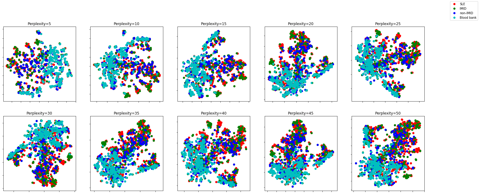
Different perplexities don’t seem to change the overall picture too much
UMAP
Toy data
Default parameters
digits = load_digits()fig, ax_array = plt.subplots(20, 20)
axes = ax_array.flatten()
for i, ax in enumerate(axes):
ax.imshow(digits.images[i], cmap='gray_r')
plt.setp(axes, xticks=[], yticks=[], frame_on=False)
plt.tight_layout(h_pad=0.5, w_pad=0.01)
reducer = umap.UMAP(random_state=42)embedding = reducer.fit_transform(digits.data)
embedding.shape(1797, 2)plt.scatter(embedding[:, 0], embedding[:, 1], c=digits.target, cmap='Spectral', s=5)
plt.gca().set_aspect('equal', 'datalim')
plt.colorbar(boundaries=np.arange(11)-0.5).set_ticks(np.arange(10))
plt.title('UMAP projection of the Digits dataset', fontsize=24);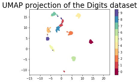
Play with parameters
np.random.seed(42)
data = np.random.rand(800, 4) # sample from 4 dimensions
fit = umap.UMAP()
%time u = fit.fit_transform(data)CPU times: user 6.46 s, sys: 522 ms, total: 6.98 s
Wall time: 2.91 splt.scatter(u[:,0], u[:,1], c=data) # plot 4D data as: R,G,B,alpha
plt.title('UMAP embedding of random colours');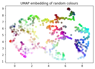
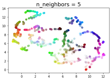
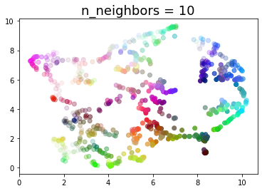
def draw_umap(n_neighbors=15, min_dist=0.1, n_components=2, metric='euclidean', title=''):
fit = umap.UMAP(
n_neighbors=n_neighbors,
min_dist=min_dist,
n_components=n_components,
metric=metric
)
u = fit.fit_transform(data);
fig = plt.figure()
if n_components == 1:
ax = fig.add_subplot(111)
ax.scatter(u[:,0], range(len(u)), c=data)
if n_components == 2:
ax = fig.add_subplot(111)
ax.scatter(u[:,0], u[:,1], c=data)
if n_components == 3:
ax = fig.add_subplot(111, projection='3d')
ax.scatter(u[:,0], u[:,1], u[:,2], c=data, s=100)
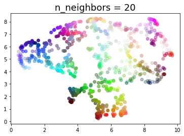
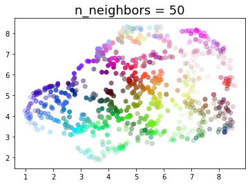
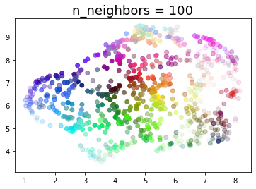
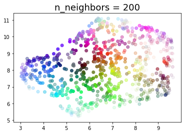
plt.title(title, fontsize=18)n_neighbors
for n in (2, 5, 10, 20, 50, 100, 200):
    draw_umap(n_neighbors=n, title='n_neighbors = {}'.format(n))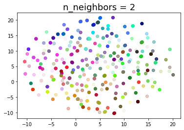
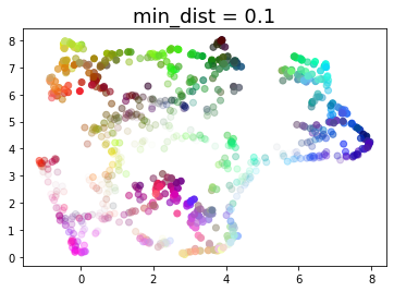
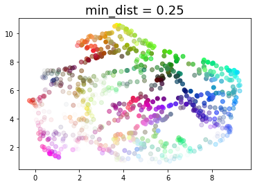
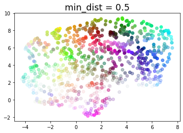
min_dist
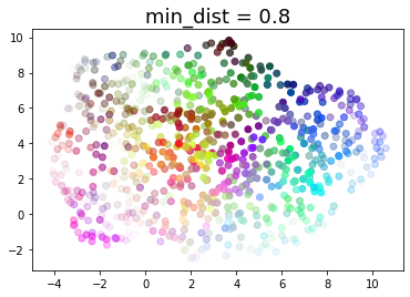
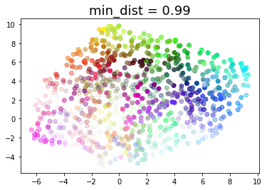
for d in (0.0, 0.1, 0.25, 0.5, 0.8, 0.99):
    draw_umap(min_dist=d, title='min_dist = {}'.format(d))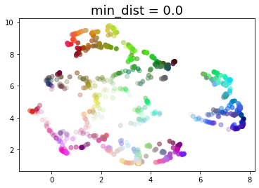
Real data
sc = StandardScaler()
trf = PowerTransformer(method='box-cox')
df_combined = pd.concat([data_all, rest[rest.Class.isin(['preSLE', 'rest_large'])]])
df_combined['Class'] = pd.Categorical(df_combined.Class, categories = ['SLE','IMID','nonIMID','rest_large','BBD','preSLE']) # order for plotting: largest groups first
df_combined.sort_values(by='Class', inplace=True)
X_combined = np.array(df_combined.loc[:, ~df_combined.columns.isin(symptoms + ['Class'] + ['Symptoms'] + ['dsDNA1'])])
X_combined_scaled = trf.fit_transform(X_combined+1)Default parameters
umap_obj = umap.UMAP(random_state=42)
Y_umap = umap_obj.fit_transform(X)
Y_umap_combined = umap_obj.fit_transform(X_combined_scaled)# add umap results back to pandas dataframes
df['umap_1'] = Y_umap[:,0]
df['umap_2'] = Y_umap[:,1]# add umap results back to pandas dataframes
df_combined['umap_1'] = Y_umap_combined[:,0]
df_combined['umap_2'] = Y_umap_combined[:,1]df_combined.Class.value_counts()SLE 483
rest_large 462
BBD 361
IMID 346
nonIMID 218
preSLE 17
Name: Class, dtype: int64with sns.plotting_context("paper"):
sns.set(font="Arial")
sns.set_style('white')
f, ax = plt.subplots(figsize=(5.5, 5.5))
g = sns.scatterplot(x='umap_1',y='umap_2',
hue='Class', style='Class', size='Class',
markers = {"SLE": "o", "rest_large": "o", "BBD": "o", "IMID": "o", "nonIMID": "o", "preSLE": "o"},
sizes = {"SLE": 20, "rest_large": 20, "BBD": 20, "IMID": 20, "nonIMID": 20, "preSLE": 20},
palette={"SLE": '#0072B2', "rest_large": '#D55E00', "BBD": '#CC79A7', "IMID": '#009E73', "nonIMID": '#E69F00', "preSLE": '#000000'},
alpha=.7,
data=df_combined,
ax=ax)
legend = ax.legend(frameon=False, loc = 'upper left', bbox_to_anchor=(0,1.05)) # remove legend box; push legend up from upper left
ax.set_xlabel('Dimension 1'); ax.set_ylabel('Dimension 2');
ax.set_ylim(-6,0)
new_labels = ['','SLE','IMID','Non-IMID','Rest','BBD','Pre-SLE']; # remove legend title and change group spelling
for t, l in zip(legend.texts, new_labels): t.set_text(l)
sns.despine(fig=f,ax=ax)
#f.savefig('umap.png', bbox_inches='tight', dpi=300, transparent=True)
#sf.savefig('umap.pdf', bbox_inches='tight', transparent=True)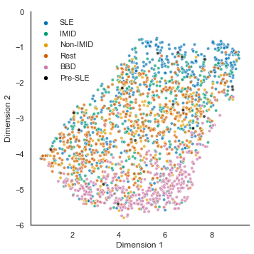
def umap_vs_tsne(df,label):
    plt.figure(figsize=(14,7))

    ax1 = plt.subplot(1, 2, 1)
    sns.scatterplot(
        x="tsne_1", y="tsne_2",
        hue=label,
        data=df,
        alpha=0.5,
        legend=False,
        ax=ax1)
    ax1.set_title("t-SNE (default)")
    plt.axis('off')
    ax2 = plt.subplot(1, 2, 2)
    sns.scatterplot(
        x="umap_1", y="umap_2",
        hue=label,
        data=df,
        alpha=0.5,
        ax=ax2)
    ax2.set_title("UMAP (default)")
plt.axis('off')umap_vs_tsne(df,'Class')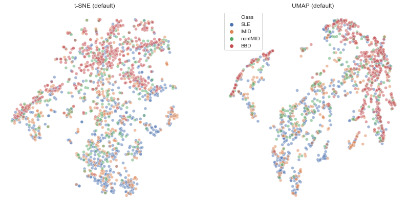
Looks fairly similar to t-SNE results. Clustering of blood bank controls is even clearer, while perhaps SLE is less clear
# filter patients with no symptoms
umap_vs_tsne(df[df['Symptoms'].isin(['nefritis_only','arthritis_only','pleurisy_or_pericarditis_only', 'nefritis'])],'Symptoms')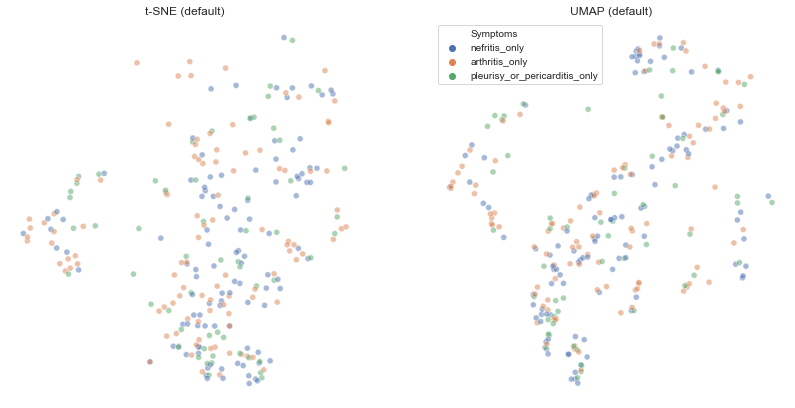
Interactive (with all points)
from bokeh.plotting import show, save, output_notebook, output_file
output_notebook()hover_data = df[['Class','Symptoms']].reset_index()mapper = umap_obj.fit(X)p = umap.plot.interactive(mapper, labels=y_class, hover_data=hover_data, point_size=4, theme='fire')
show(p)p = umap.plot.interactive(mapper, labels=y_symptom, hover_data=hover_data, point_size=4, theme='fire')
show(p)Different parameters
n_neighborss = (2, 5, 10, 20, 50, 100, 200)
min_dists = (0.0, 0.1, 0.25, 0.5, 0.8, 0.99)
(fig, subplots) = plt.subplots(len(min_dists), len(n_neighborss), figsize=(30,30))
for i, n_neighbors in enumerate(n_neighborss):
for j, min_dist in enumerate(min_dists):
ax = subplots[j][i]
u = umap.UMAP(n_neighbors=n_neighbors, min_dist=min_dist).fit_transform(X);
df_params = pd.DataFrame({'umap_1': u[:,0], 'umap_2': u[:,1], 'Class': y_class.values})
sns.scatterplot(x='umap_1', y='umap_2', hue='Class', data=df_params, alpha=0.5, ax=ax, legend=False)
ax.set_title('n_neighbors = {}, min_dist = {}'.format(n_neighbors, min_dist))
ax.axis('off')/home/lcreteig/miniconda3/envs/SLE/lib/python3.7/site-packages/sklearn/manifold/_spectral_embedding.py:236: UserWarning: Graph is not fully connected, spectral embedding may not work as expected.
warnings.warn("Graph is not fully connected, spectral embedding"
/home/lcreteig/miniconda3/envs/SLE/lib/python3.7/site-packages/sklearn/manifold/_spectral_embedding.py:236: UserWarning: Graph is not fully connected, spectral embedding may not work as expected.
warnings.warn("Graph is not fully connected, spectral embedding"
/home/lcreteig/miniconda3/envs/SLE/lib/python3.7/site-packages/sklearn/manifold/_spectral_embedding.py:236: UserWarning: Graph is not fully connected, spectral embedding may not work as expected.
warnings.warn("Graph is not fully connected, spectral embedding"
/home/lcreteig/miniconda3/envs/SLE/lib/python3.7/site-packages/sklearn/manifold/_spectral_embedding.py:236: UserWarning: Graph is not fully connected, spectral embedding may not work as expected.
warnings.warn("Graph is not fully connected, spectral embedding"
/home/lcreteig/miniconda3/envs/SLE/lib/python3.7/site-packages/sklearn/manifold/_spectral_embedding.py:236: UserWarning: Graph is not fully connected, spectral embedding may not work as expected.
warnings.warn("Graph is not fully connected, spectral embedding"
/home/lcreteig/miniconda3/envs/SLE/lib/python3.7/site-packages/sklearn/manifold/_spectral_embedding.py:236: UserWarning: Graph is not fully connected, spectral embedding may not work as expected.
warnings.warn("Graph is not fully connected, spectral embedding"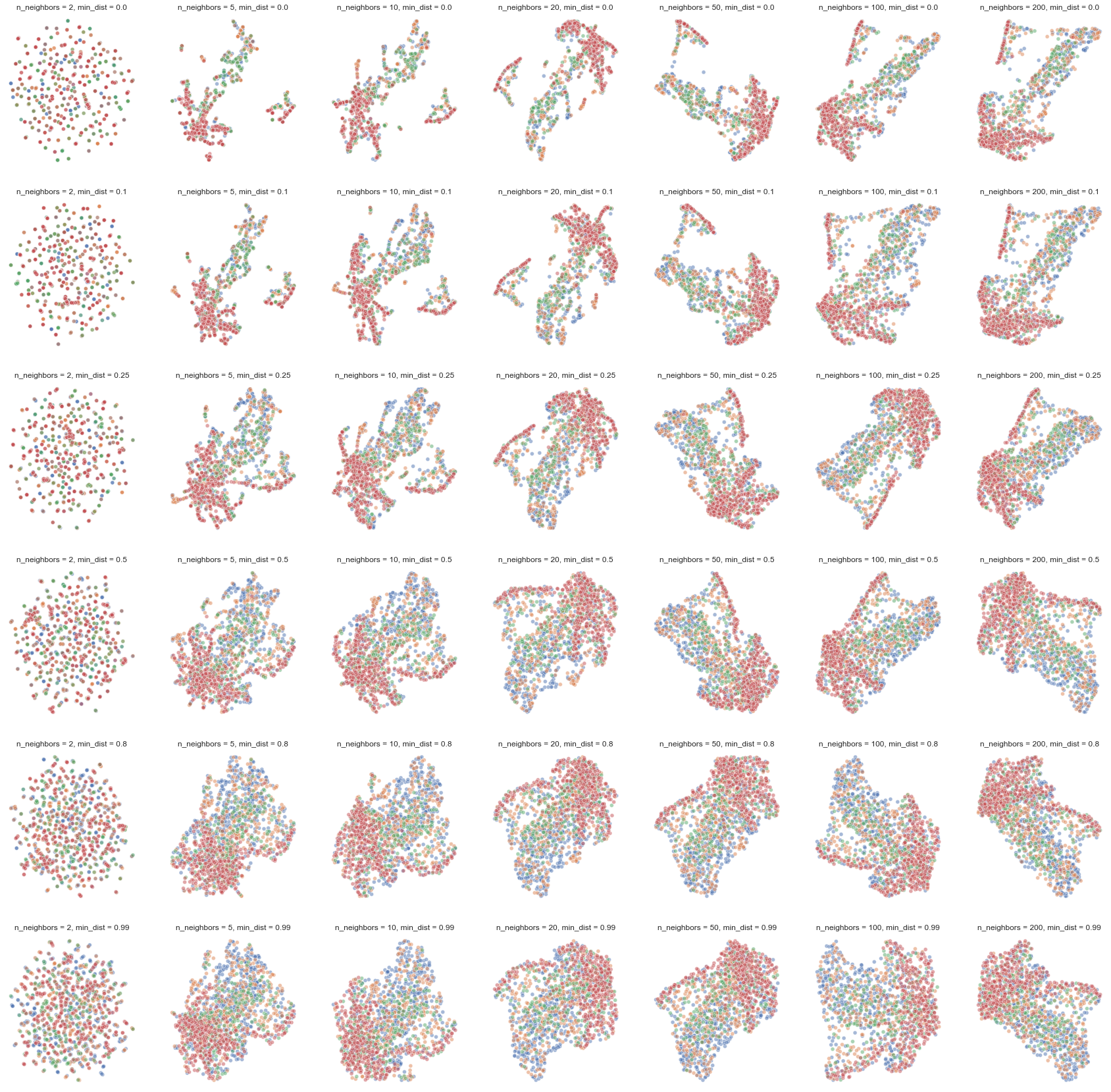
Overall pattern remains the same. Could consider slightly higher than default parameters (for both) if we want a less “pinched” shape